Important Note
This is the documentation for gluestack-ui v2 (beta). For @gluestack-ui/themed (stable) documentation, refer to gluestack-ui v1.
Figma UI Kit
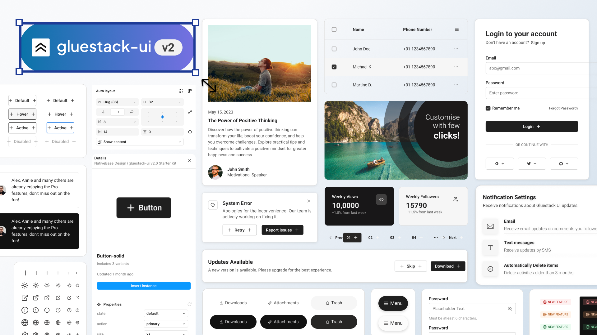
The Figma UI Kit provides a collection of ready-to-use UI components from the gluestack-ui library. So you can directly use these components in Figma and design your app. The developers won't have a chance to say this is not possible!

What is included?
Discover the comprehensive features of our latest Figma UI Kit, designed to enhance your design workflow with consistency, efficiency, and customization. Here's a breakdown of what you can expect:
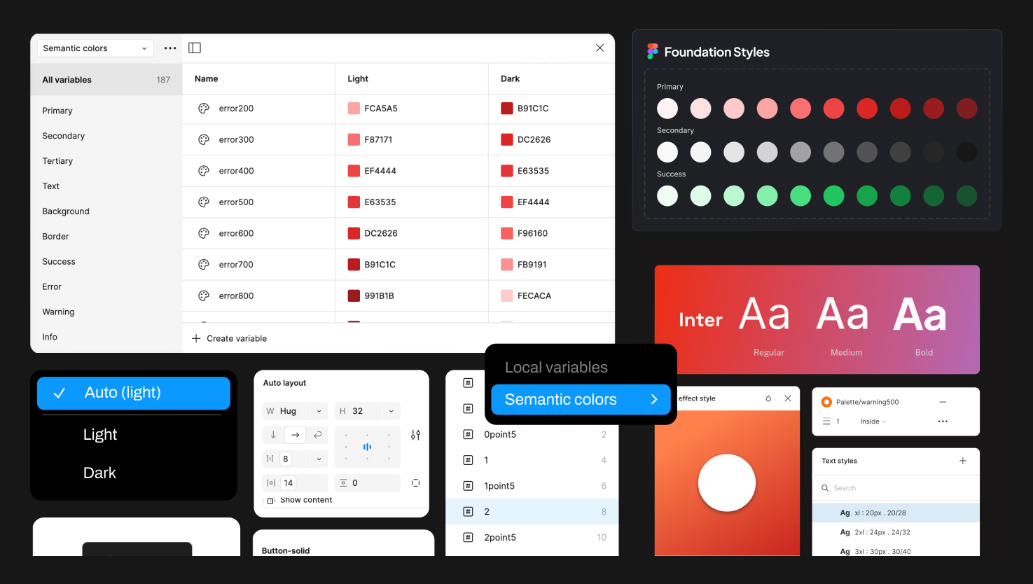
- Color Tokens: Color tokens in Figma provide a systematic way to manage and use colors in your design projects. They ensure consistency and simplify updates by defining a centralized set of color values reusable throughout the project. Our kit includes an extended color palette added as styles, semantic colors as variable collections, and a set of fixed colors that remain unchanged across modes.
- Text Tokens: Text tokens in Figma enable you to define and manage consistent text properties like font, size, line spacing, and color. Our Figma UI Kit features two main foundation components, Text and Heading, with various sizes and font weights. You can easily customize these styles and typography properties to align with your brand.
- Shadow Tokens: Shadow tokens, also known as effect styles, allow you to define and manage effects such as drop shadows, strokes, blurs, and images. Our kit includes two primary shadows, Hard and Soft, covering different light source directions and intensities.
- Components: Components in Figma are reusable design elements that ensure consistent and efficient designs. They can represent UI elements, icons, buttons, or any visual elements you want to reuse. Our Figma UI Kit includes around 23 components with instances mapped in compound components, enabling you to design screens effortlessly with common primitive components.
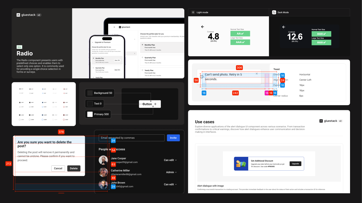
- Additional Examples: We've added more components and their use cases in the latest version. These examples demonstrate how components can be customized to meet user needs.
Incorporated Features -
The Figma kit includes all the latest Figma features, making it an excellent starting point for any design system. The gluestack kit leverages the following advanced features to enhance your design process and streamline your workflow.
AutoLayout Support
Figma's AutoLayout feature allows for the creation of responsive and flexible designs by automatically adjusting the layout and spacing of elements within frames. This ensures that designs adapt seamlessly to various screen sizes and content changes. All components in our file are equipped with AutoLayout, enabling consistent design across mobile, tablet, and desktop devices.
Variable Support
The latest variable feature in Figma simplifies the process of switching between light and dark modes. With just one click, you can toggle between these modes, ensuring that designs are optimized for different viewing preferences.

Taking It One Step Further
We like to elevate our offerings, and with the v2 release, users will benefit from the following enhancements:
- Detailed Documentation: Each component comes with a spec sheet, providing comprehensive information on structuring, properties, dos and don'ts, and use cases. This documentation is invaluable for anyone seeking an in-depth understanding of our design process.

- gluestack Plugin: Customization in Figma can often be a manual and time-consuming task. To streamline this, we've introduced the gluestack plugin, now available in the Figma Community. This plugin simplifies the process of linking text styles and updating font families, making customization more efficient and less tedious.