Link
Enable seamless navigation with hyperlinked text for a user-friendly website experience.
Installation
API Reference
Important Note
This is the documentation for gluestack-ui v2 (beta). For @gluestack-ui/themed (stable) documentation, refer to gluestack-ui v1.
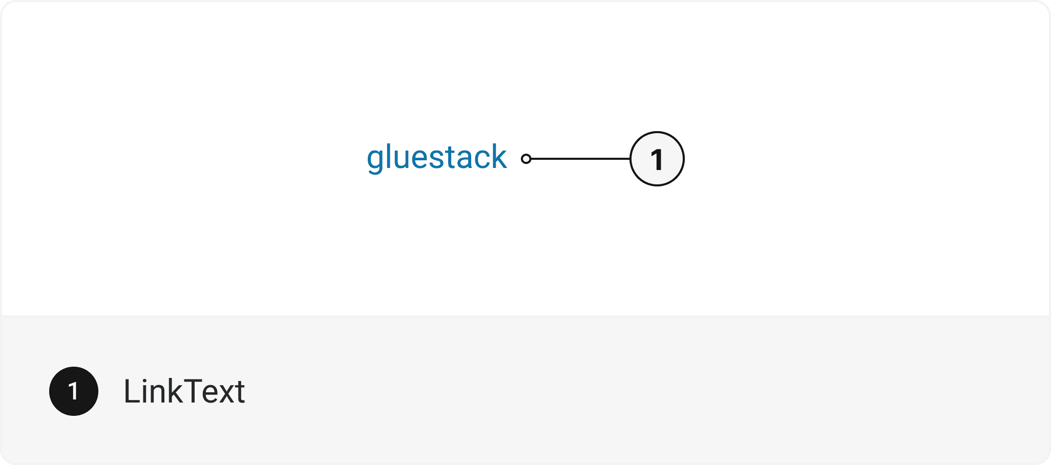
This is an illustration of Link component.
<Link href="https://gluestack.io/"><LinkText>gluestack</LinkText></Link>
Installation
CLI
Manual
Run the following command:
npx gluestack-ui add link
API Reference
To use this component in your project, include the following import statement in your file.
import { Link } from "@/components/ui/link"


export default () => (<Link><LinkText /></Link>)
Component Props
This section provides a comprehensive reference list for the component props, detailing descriptions, properties, types, and default behavior for easy project integration.
Link
Contains all link related layout style props and actions.
It inherits all the properties of React Native's Pressable component.
Prop | Type | Default | Description |
|---|---|---|---|
href | string | - | URL that should be opened on Link press. |
onPress | (event?: GestureResponderEvent) => any | - | Callback that will be invoked on Link press. |
isExternal | boolean | false | If true, link will be opened in new tab on web. It uses _target property to achieve this. |
isHovered | boolean | false | When true, the link displays a hover state. |
isFocusVisible | boolean | false | To manually set focus visible state to the link. |
LinkText
Contains all text related layout style props and actions. It inherits all the properties of React Native's Text component.
Accessibility
We have outlined the various features that ensure the Link component is accessible to all users, including those with disabilities. These features help ensure that your application is inclusive and meets accessibility standards. Adheres to the WAI-ARIA design pattern.
Keyboard
- Tab: Moves focus to the next focusable element.
- Enter: Users should be able to open a link.
Screen Reader
- VoiceOver: When a link receives focus, screen readers should announce a descriptive link name.
Props
Link component is created using Pressable component from react-native. It extends all the props supported by React Native Pressable.
Link
Name | Value | Default |
|---|---|---|
size | xs | sm | md | lg | xl | 2xl | 3xl | 4xl | 5xl | 6xl | md |
Important Note
Note: These props are exclusively applicable when utilizing the default configuration of gluestack-ui/config. If you are using a custom theme, these props may not be available.
Data Attributes Table
Component receives states as props as boolean values, which are applied as data-* attributes. These attributes are then used to style the component via classNames, enabling state-based styling.
State | Data Attribute | Values |
|---|---|---|
hover | data-hover | true | false |
active | data-active | true | false |
disabled | data-disabled | true | false |
focusVisible | data-focus-visible | true | false |
Examples
The Examples section provides visual representations of the different variants of the component, allowing you to quickly and easily determine which one best fits your needs. Simply copy the code and integrate it into your project.
Default
<HStack><Text size="lg">Design inspiration from </Text><Link href="https://gluestack.io/" isExternal><LinkText size="lg">pinterest.com</LinkText></Link></HStack>
Link with icon
<HStack><Text size="lg">Go to </Text><Link href="https://gluestack.io/" isExternal><HStack alignItems="center"><LinkText size="lg">Pinterest</LinkText>{/* ArrowUpRight is imported from 'lucide-react-native' */}<Icon as={ArrowUpRight} size="lg" className="mt-0.5 text-info-600" /></HStack></Link></HStack>
Basic Unitools Link
The below example will run for both Expo and Next.js projects. For installation steps, refer to the Installation section of @unitools/link. For the Next.js project replace the <Text> with the <p>.
import Link from "@unitools/link"
<Link href="https://gluestack.io/"><Text>gluestack</Text></Link>